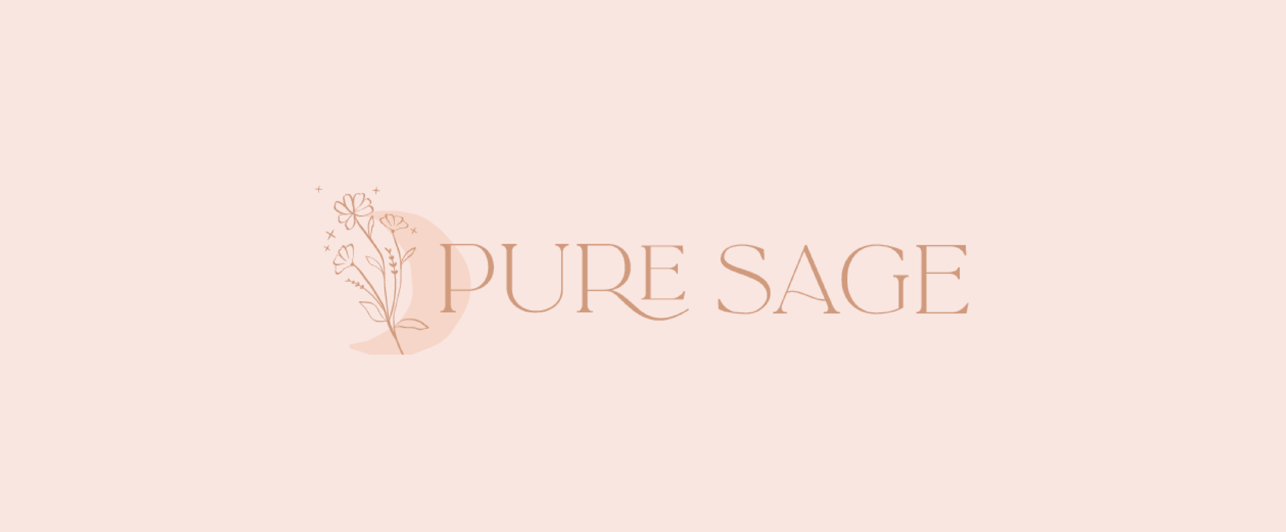
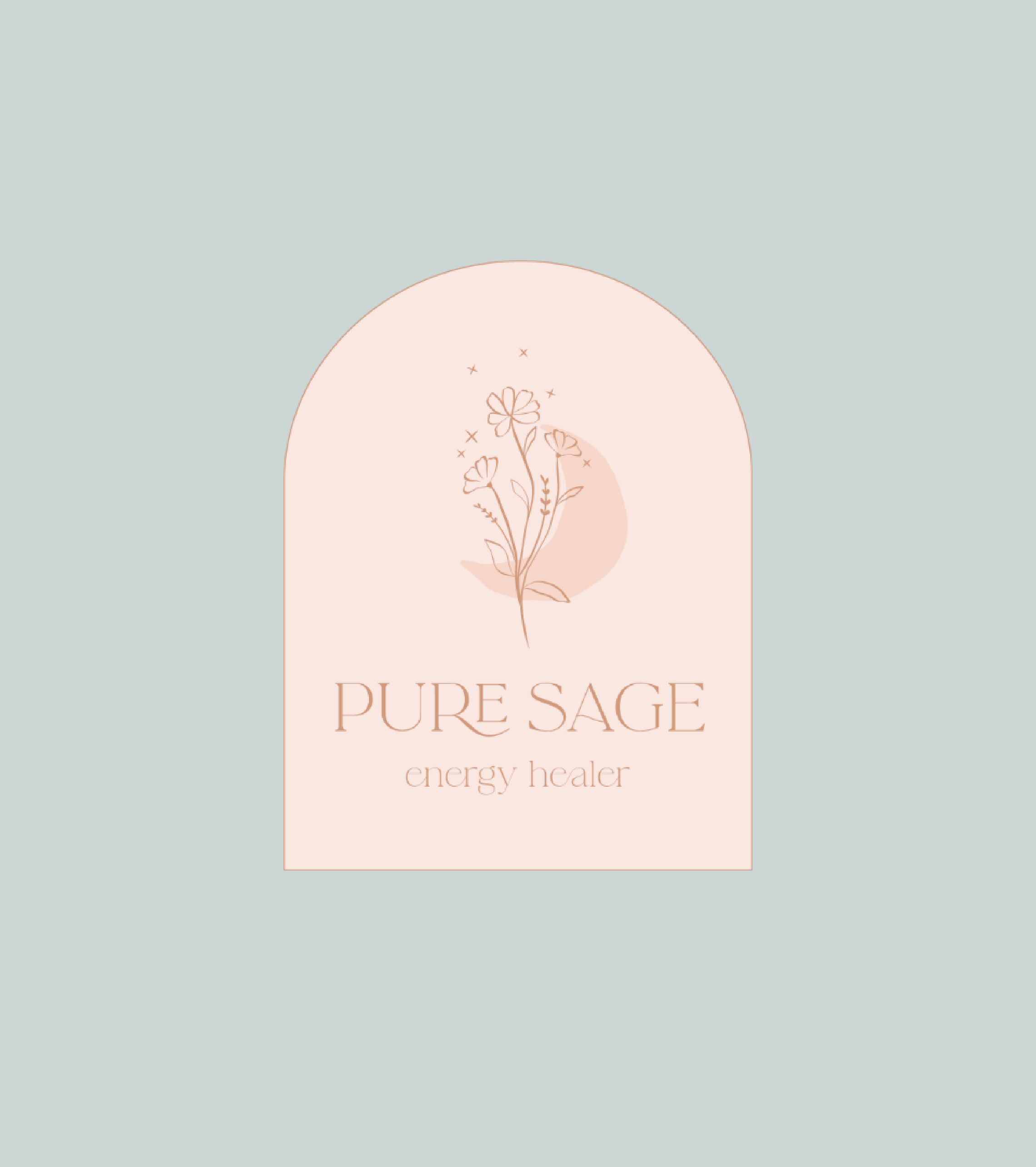
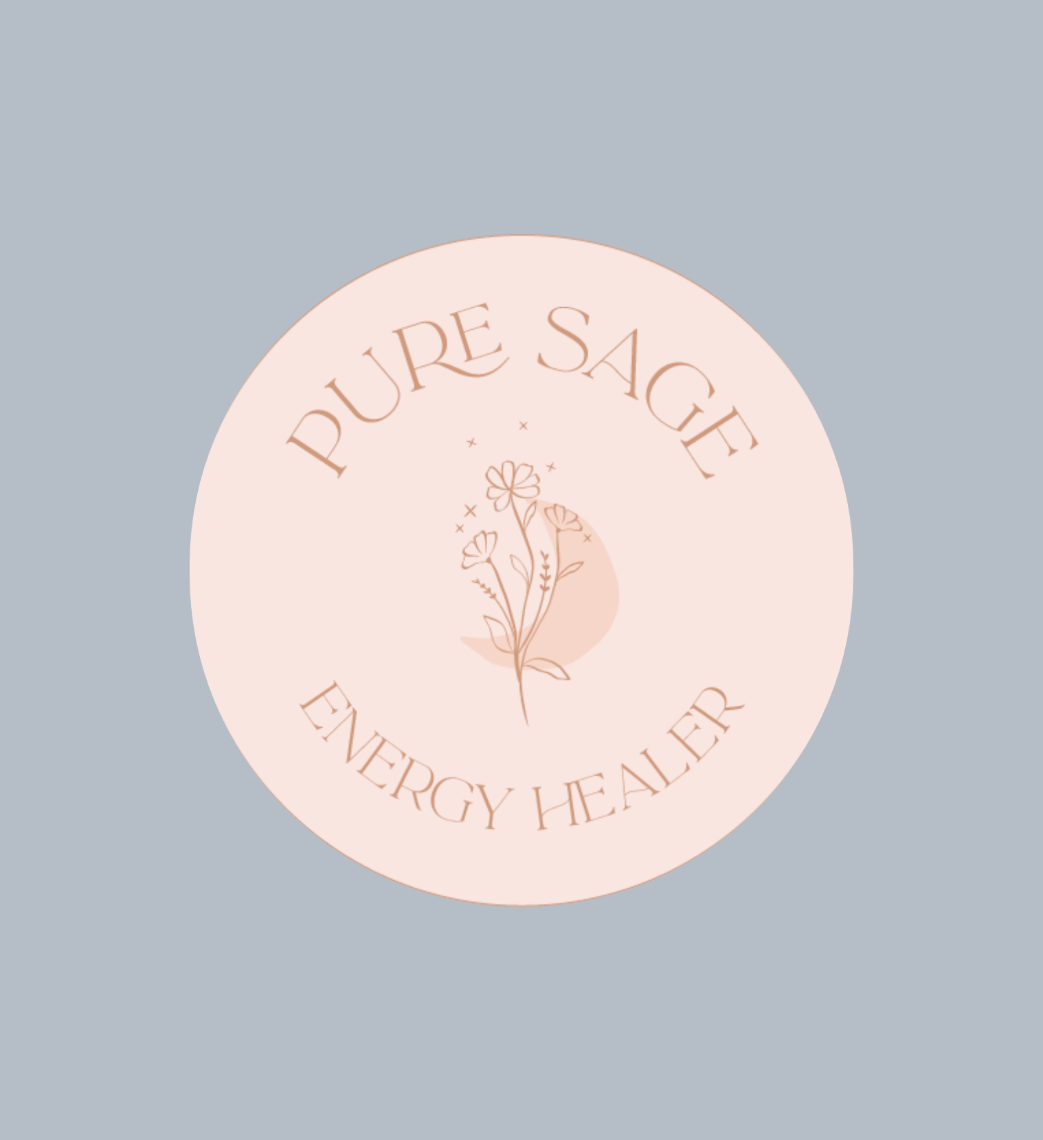
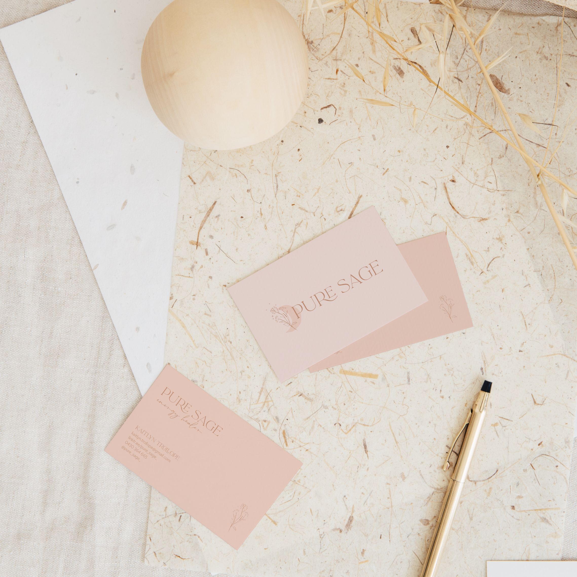
Pure Sage
Kaitlyn is an energy healer and her treatments are something very special! The brief for this rebrand was light, softening, feminine, magical and growth. A beautiful combination of things to include in branding and I was so excited to bring together all the elements of what Kaitlyn offers in her treatments. A colour palette inspired by pink sunsets, the ocean and the moon, paired with illustrations that represent the spiritual nature of Pure Sage and flowers to represent blooming and growth. It’s all in the details!
BRANDING
BRIEF: Light, softening, feminine, magical & growth.